Burger King Has A New Logo After 20+ Years
Burger King was looking to do something new, not so bold, but impactful. Hmmmm...what to do? Ah ha...they will create a new logo.
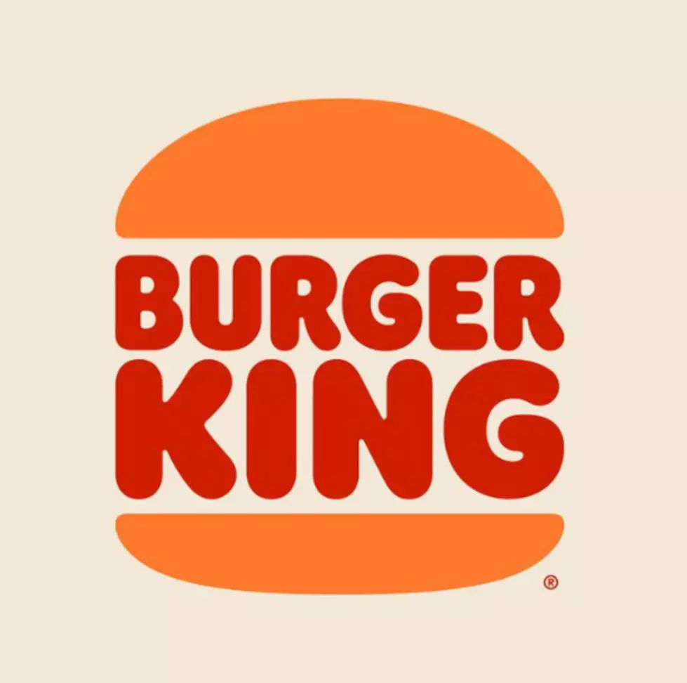
Yep, Burger King has unveiled a brand new logo, the first in over 20 years. Apparently it is inspired by classic design. It actually looks kinda retro. This new design will also include issuing new uniforms with a new color scheme.
According to restaurantbusinessonline:
"From '65 to '98 they had a strong, iconic identity, It was a true classic. They thought back at that time they looked their best. They thought that was the best representation of the brand but now the chain’s latest logo is meant to look more like a burger, signaling the brand’s focus on its food instead of the previous logo that conveyed the message speed of service"
The simplicity of the logo, with fewer shapes, fewer colors definitely looks better on the screen if you reduce the size of it. It
Apparently it is going to take several years for the new redesign to make its way completely through out all the Burger King locations. Most BK restaurants still have to work through current inventories of the old design...but keep your eyes peeled as you could see the new design out there any day.
Do you have our free radio station app yet? If not, it's the perfect way to request a song, talk to the DJs, enter exclusive contests and to stay up to date with everything that's happening in and around Central Maine and the world. When you download it, make sure you turn on the push notifications so that we can send you exclusive content and local breaking news that you need to know about first. Just enter your mobile number below and we'll send a download link right to your mobile device. After that, you can download for free and immediately begin accessing all kinds of exclusive content tailored just for you. Give it a try and stay connected with us!

UP NEXT: See how much gasoline cost the year you started driving
More From B98.5


